

Departmental Handbooks
Cover and Interior Layout
Reading Is Mandatory
Every incoming psychology student is required to read the relevant handbooks for their area and level. This means a student may end up with three handbooks (undergraduate, graduate, and one of the four areas: social, clinical, developmental, or cognition) in their possession, and an obligation to read them all -- several hundred pages in total. The problem was, this is what they looked like:

The existing versions of the handbooks had many issues, from a readability standpoint, and many more issues concerning design. In short, the existing design rationale was largely incidental, which is a nice way of saying that they were just Microsoft Word documents using default settings and contained many accidents. Page numbers were hand-typed and therefore incorrect where added content pushed lines to the next page, line breaks had been added manually to control widowed and orphaned lines and suffered from the same problem as content length changed elsewhere. The tables of contents were typed manually in a process both inefficient and unreliable, fonts and spacings were inconsistent, tables contained no cell padding, line heights were often too small to be read comfortably. The list went on and on. Clearly, I had some work ahead of me if I was going to save 2018's incoming students from severe eye strain, and save the staff a lot of work with every new update.
Easy To Update
The root of the problems seemed to be the workflow utilized in writing and updating these books. Members of faculty shared the documents by email, making updates and sending them along to the next person. Inconsistencies introduced along this chain would be quickly integrated and ignored. There was no version control system or filenaming convention, and so it was difficult to tell whether versions had branched or if any given file was the most recently-updated. My first step was to gather up all versions of the documents and reconcile them into definitive, latest versions, which could be confidently stated to be the most up-to-date. This led to the discovery of a forked update of one of the handbooks, which took a long time to correct. With some lightweight digital forensics, I was able to determine where the fork occurred and which discrepancies between documents were intentional changes and which would have been reversions. Problem solved.
After implementing a filename convention, instructions on exporting finished versions to PDF, and strict chain-of-possession protocols for the update process (which I dearly hope will be followed now that I have left the department), I created the templates in Microsoft Word and extensively defined the typographic styles within Word's own feature set. Normally, I would prefer to use Adobe InDesign for publishable layouts, but editability was a chief concern on this project. If I were to present the faculty with an INDD file, they would have no choice but to return to the old style as soon as updates were necessary. It had to be a DOC if the redesign was to survive.

These new versions utilized several of Word’s features to make formatting easier for non-designers. Formats for headings, subheadings, paragraphs, numbered lists and bulleted lists are defined in Word’s Styles palette, keeping them consistent throughout each document. Because Heading Styles are in use, the Table of Contents is able to update automatically, detecting all instances of Heading 1 and Heading 2 and adding them to the table along with their page numbers. New sections create their own page breaks automatically, and paragraph heads will stay with their following paragraphs – there is no need to add extra space in order to manage them. Fonts are embedded in the documents, making them editable on multiple machines without requiring special font files to be installed. Inside each document, the date of last revision on the inside cover updates itself when the Word doc is opened, so each time it is exported to a PDF it will be easy to tell when the file was changed. This will prevent many of the earlier issues from recurring.

Typographically Mindful
Production aside, the purpose of the handbooks is for the students to read them. Addressing this concern necessitated an overhaul of the typographic styles in use, with comfort in mind. Because students are expected to read the handbooks in their entirety, readability is a foremost concern of these designs, and so a generous line height and large bottom margin give even long paragraphs breathability without an overall feeling of heaviness. Tightened margins and hanging indents make bulleted and numbered lists stand out, and paragraph headings allow the topic of a text block to be unobtrusively declared so that it may be easily spotted at a flip-through. Body copy is set in Adobe Caslon, a classic font first created by the engraver William Caslon in around 1728 and digitized in 1990 by the typographer Carol Twombly. It is a readable, humanist typeface with light serifs, first becoming popular in the days of metal letterpress and used for everything from early copies of the U.S. Declaration of Independence to modern printings of New Yorker magazine. Titles are set in Optima, a typeface designed by Hermann Zapf in 1950, inspired by Renaissance-era carvings he saw while on holiday in Italy.

Go On, Judge These Books
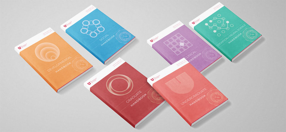
By redesigning all the handbooks as a series, there was an opportunity to create a consistent thematic visual system while establishing a recognizably unique identity for each department. I chose a modernist, slightly Bauhaus-esque aesthetic with a warm and friendly color palette.

Each of the area handbooks features a graphic distinct to the meaning of that specialty.
- Developmental uses a series of circles increasing in size to represent growth and change over time, a classic Bronfenbrenner ecological diagram. The tangerine orange color evokes fruit or flowers; generative, growing things.
- Social uses a chain-link design of overlapping rings to represent the connections and interactions between people. The blue color evokes communication and friendship, as it features prominently in most of today’s popular messaging and social media apps.
- Cognition uses a set of nodes and a circuit-like conduit diagram to represent the process of learning and cognition. The pale green also evokes this category, with its similarity to the color of surgical scrubs and to the electronics of a PCB circuitboard.
- Clinical uses an odd-one-out grid of regular squares, with one rotated and with reverse coloration to represent the process of analysis, diagnosis, and correction. The color purple evokes the sub-conscious and can represent struggle or healing, as in the Purple Heart.
Current as of 2018
All six handbooks are available for download on the University of Utah website, under the various sections sorted by discipline. Aside from the Undergraduate Handbook, the five Graduate-level handbooks are in the Ph.D. program section.
Visit the University of Utah Graduate Program website.
Book mockup images via Behance, author unknown.